As a dynamic, multi-generational community, Am Shalom is both rooted in tradition and always evolving. Like all self-reflecting congregations, we embrace opportunities to consider our identity and how we present ourselves.
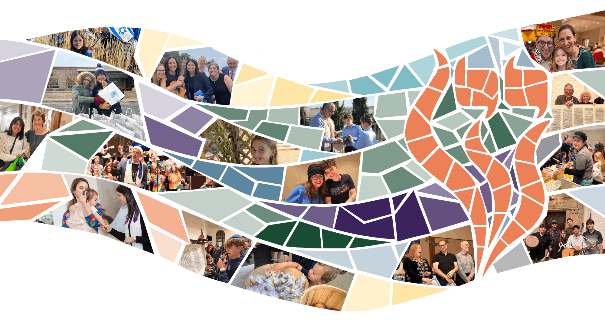
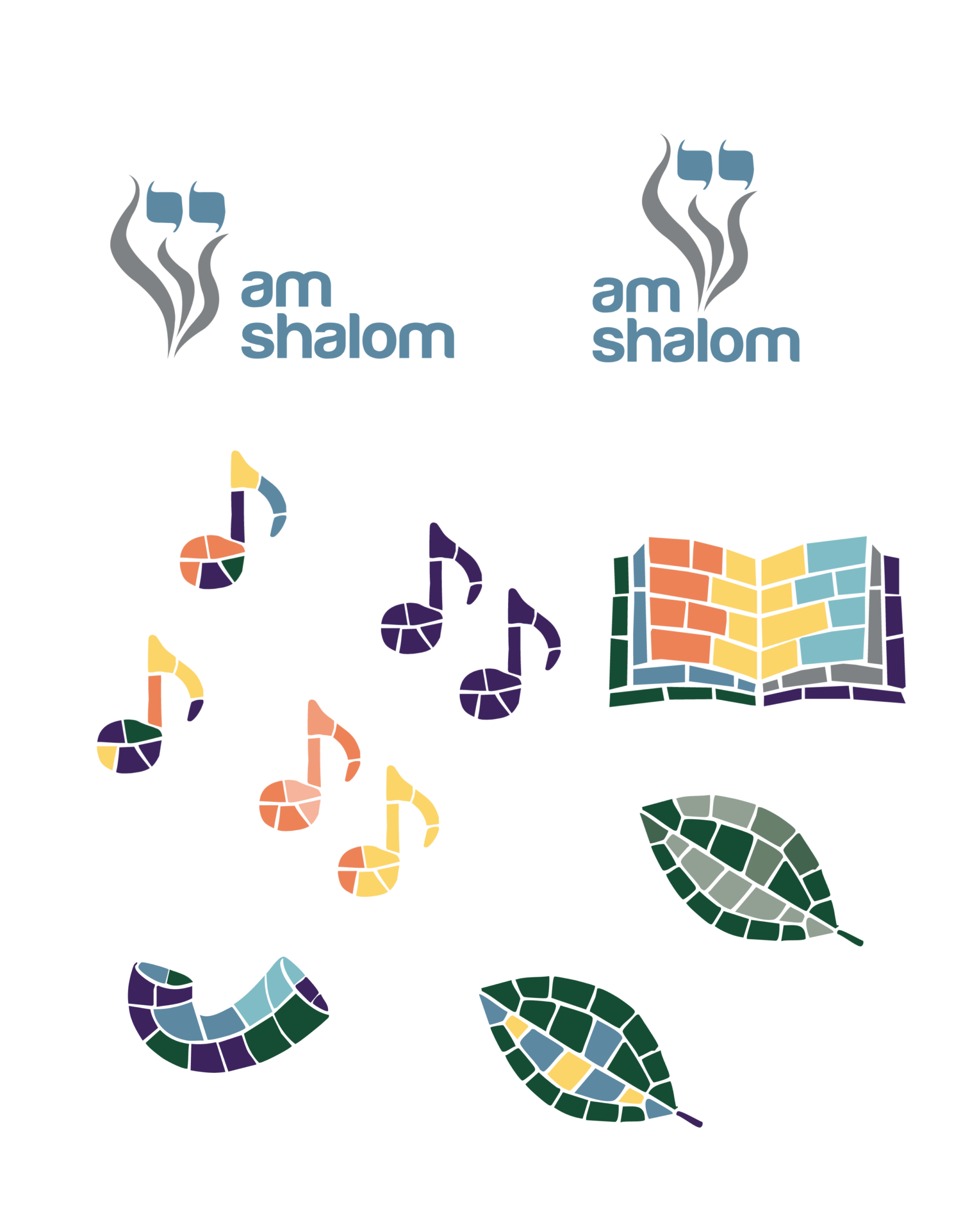
During the summer of 2025, a committee of clergy, staff, and board members came together to develop a new visual identity, which was developed through several group feedback sessions, working with the design team at Gem Box Studio. After considering inspiration from a variety of sources, the team ultimately found its strongest influence in the synagogue’s stunning historic Beth Am mosaic.
The final visual identity was rolled out spring 2026.